Packaging Design / Brand Identity / Concept DevelopmentMARIN
A conceptual packaging project where sustainability meets Japanese-inspired visual storytelling. Form, material, and narrative come together to challenge how bathroom products look and feel.
The brand is built on Japanese values: simplicity, respect for nature, and intentional material use. The name MARIN comes from a personal experience during my exchange studies in Japan, where my name Malin is pronounced Marin, a word closely tied to the sea. That connection became the starting point for a brand focused on protecting marine environments from plastic pollution.
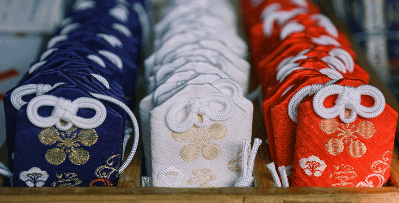
Inspirational Elements
omamori
charm
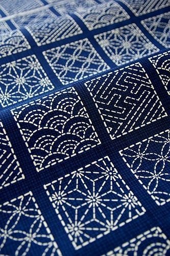
sashiko
stiching
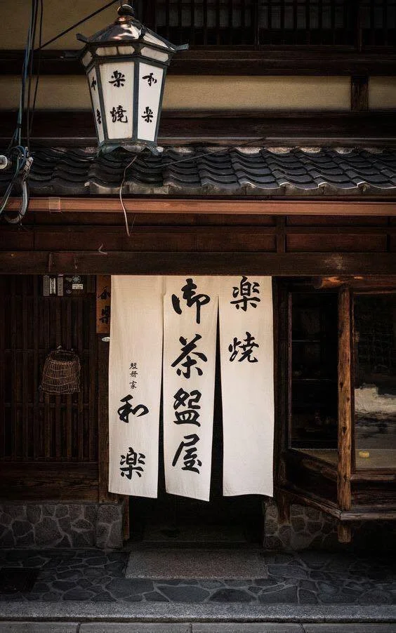
noren curtains
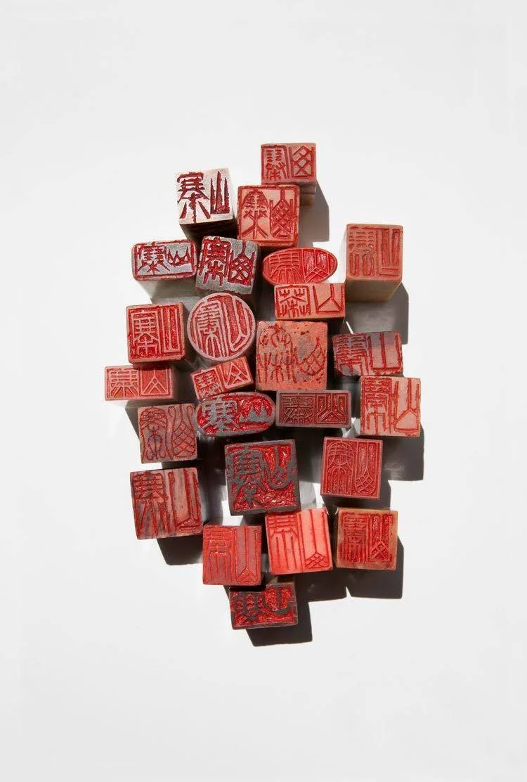
hanko
stamp
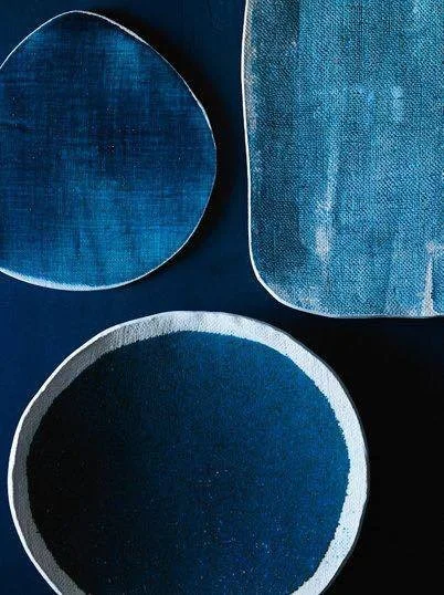
aizome blue dye
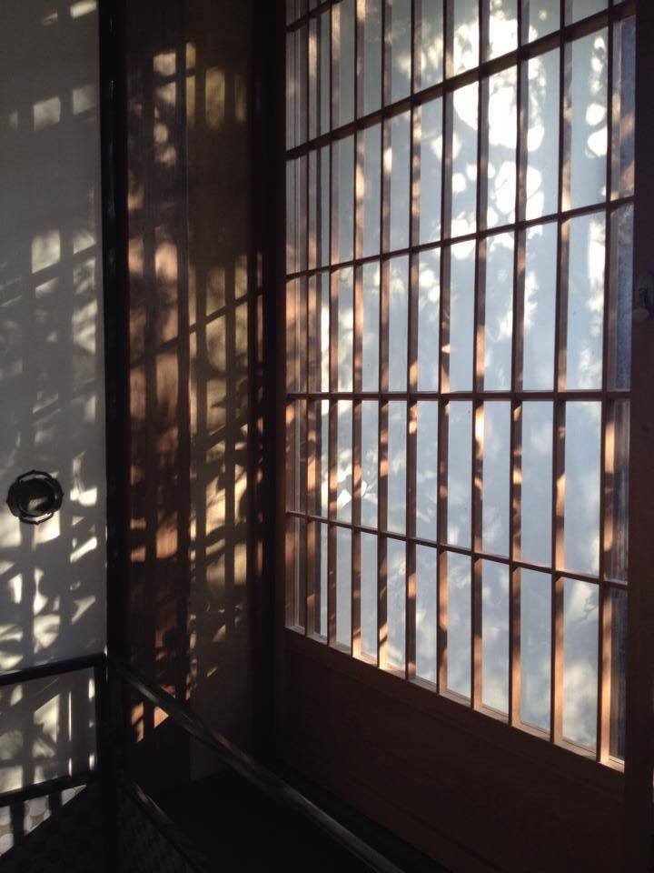
shōji
screens
Visual Identity
The visual language takes inspiration from traditional Japanese references including shōji screens, noren curtains, hanko stamps, sashiko stitching, omamori charms, and aizome blue dye. Together they shaped a calm, grid-based system built around balance, translucency, and clarity.
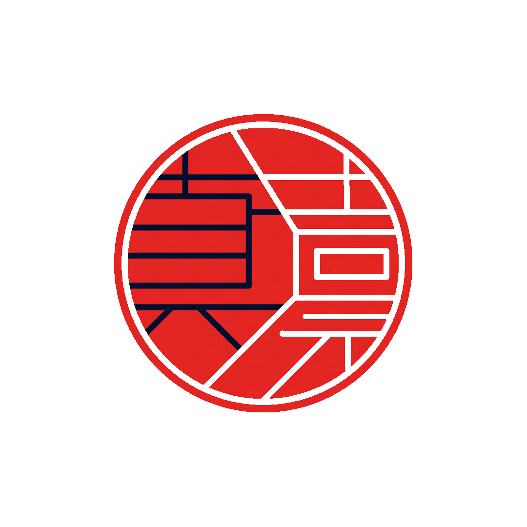
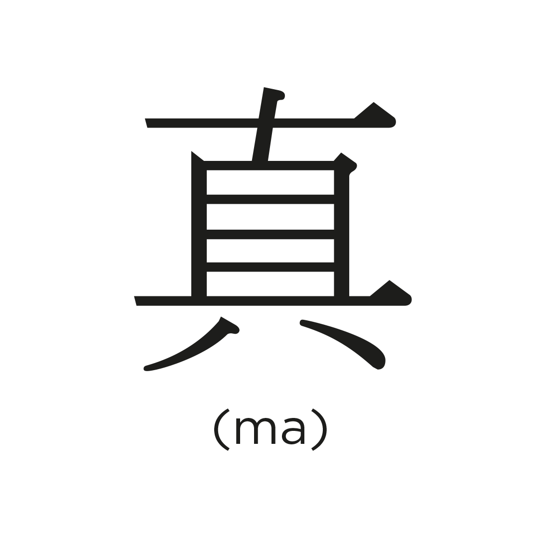
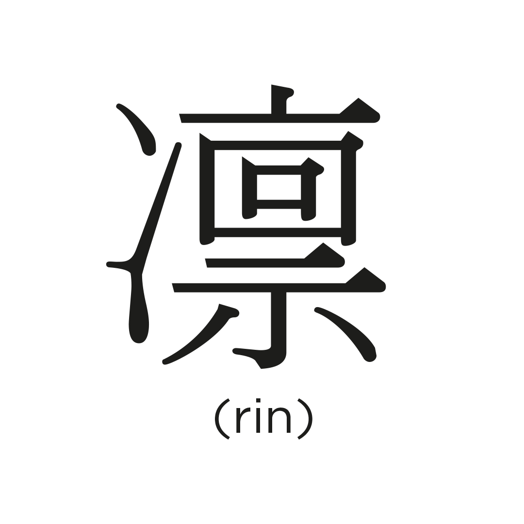
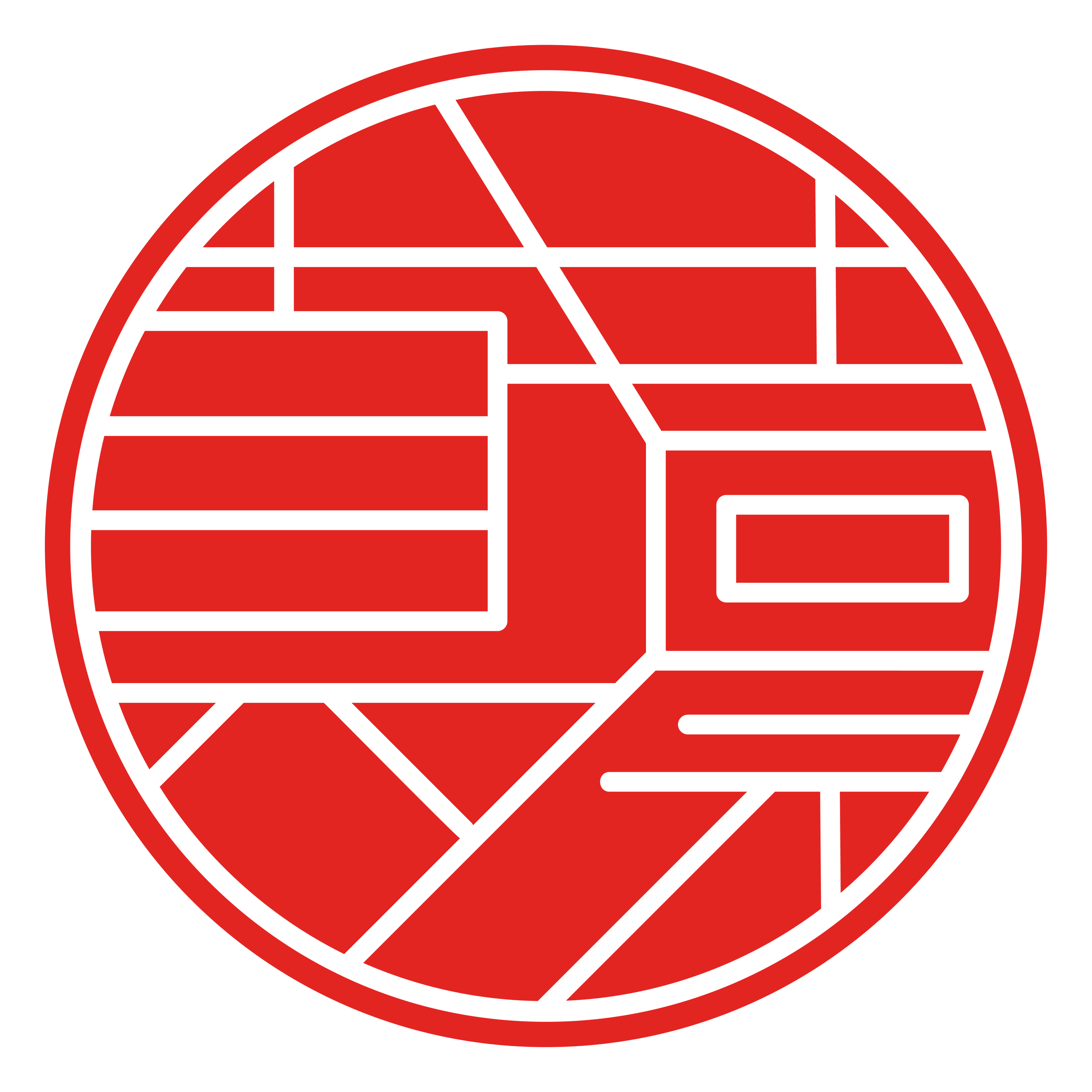
The logo works both vertically and horizontally, nodding to the flexibility of Japanese writing. It brings together a red circle inspired by the Japanese flag, the brand name MARIN, and the kanji 真 (ma) and 凛 (rin).
Visual Element
A key element of MARIN’s visual identity is the red circle, inspired by the hanko stamp—a traditional seal used as a personal signature in many East Asian cultures. In this context, the stamp contains the kanji characters 真 (ma) and 凛 (rin), which together signify truthfullness.
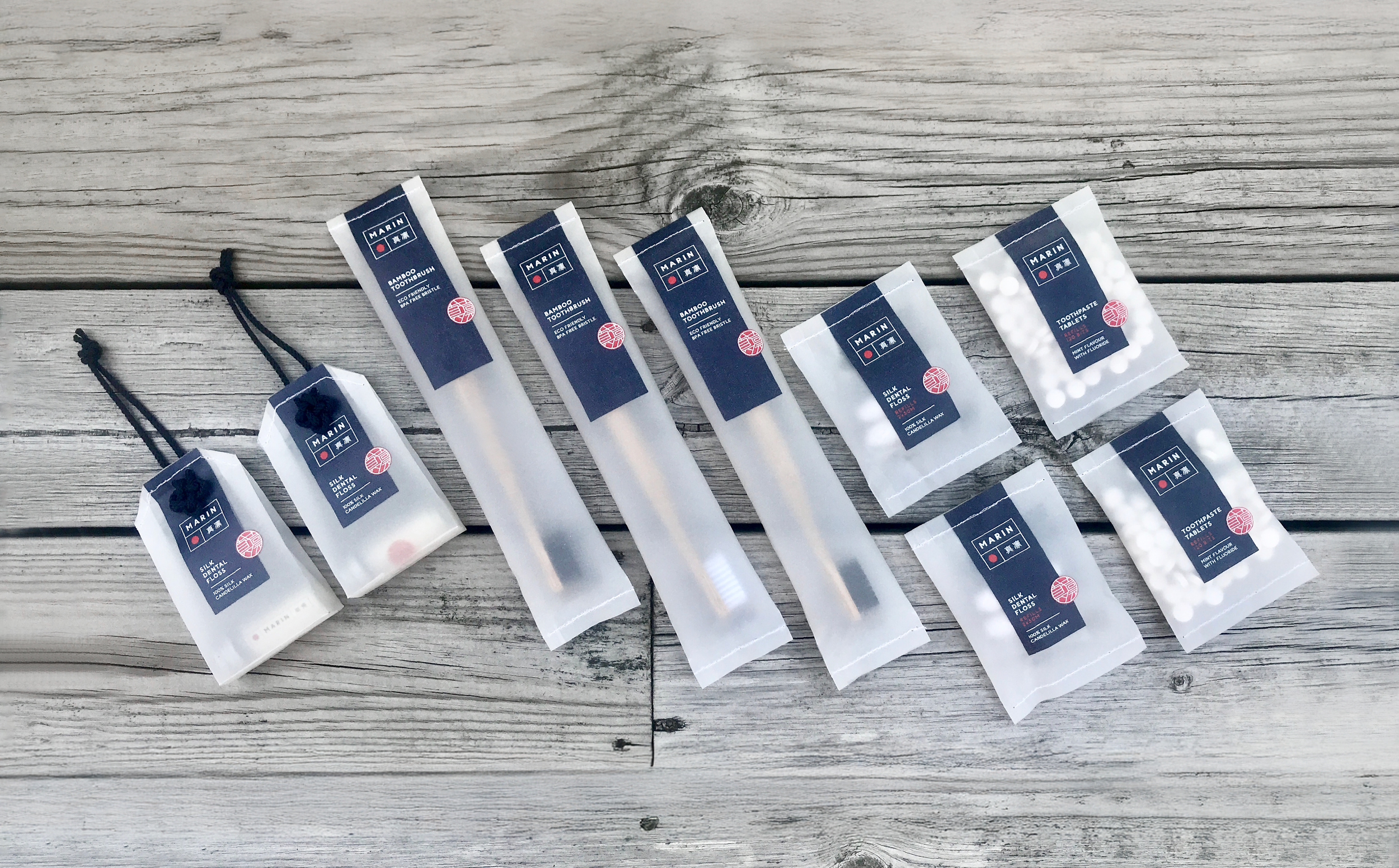
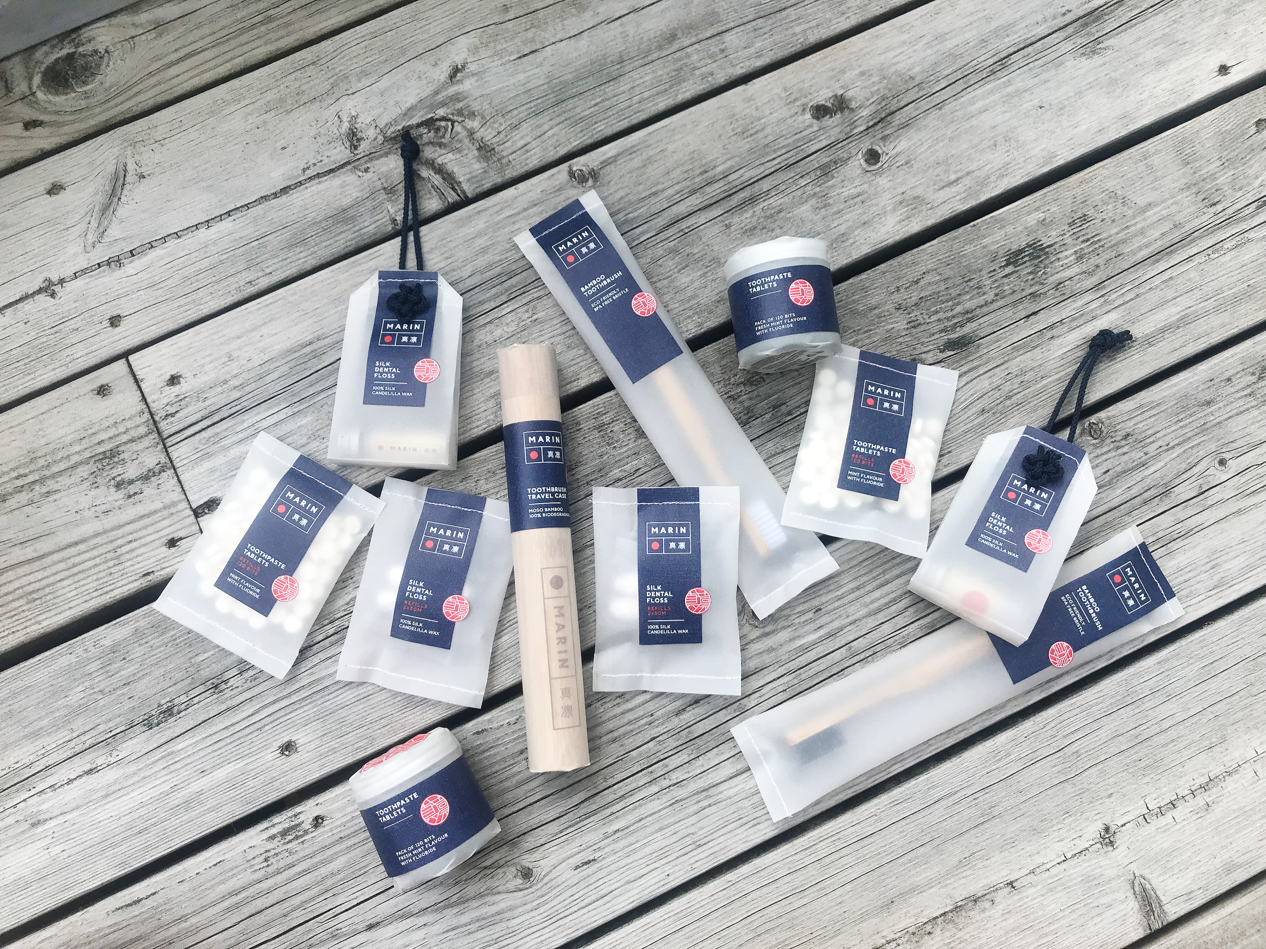
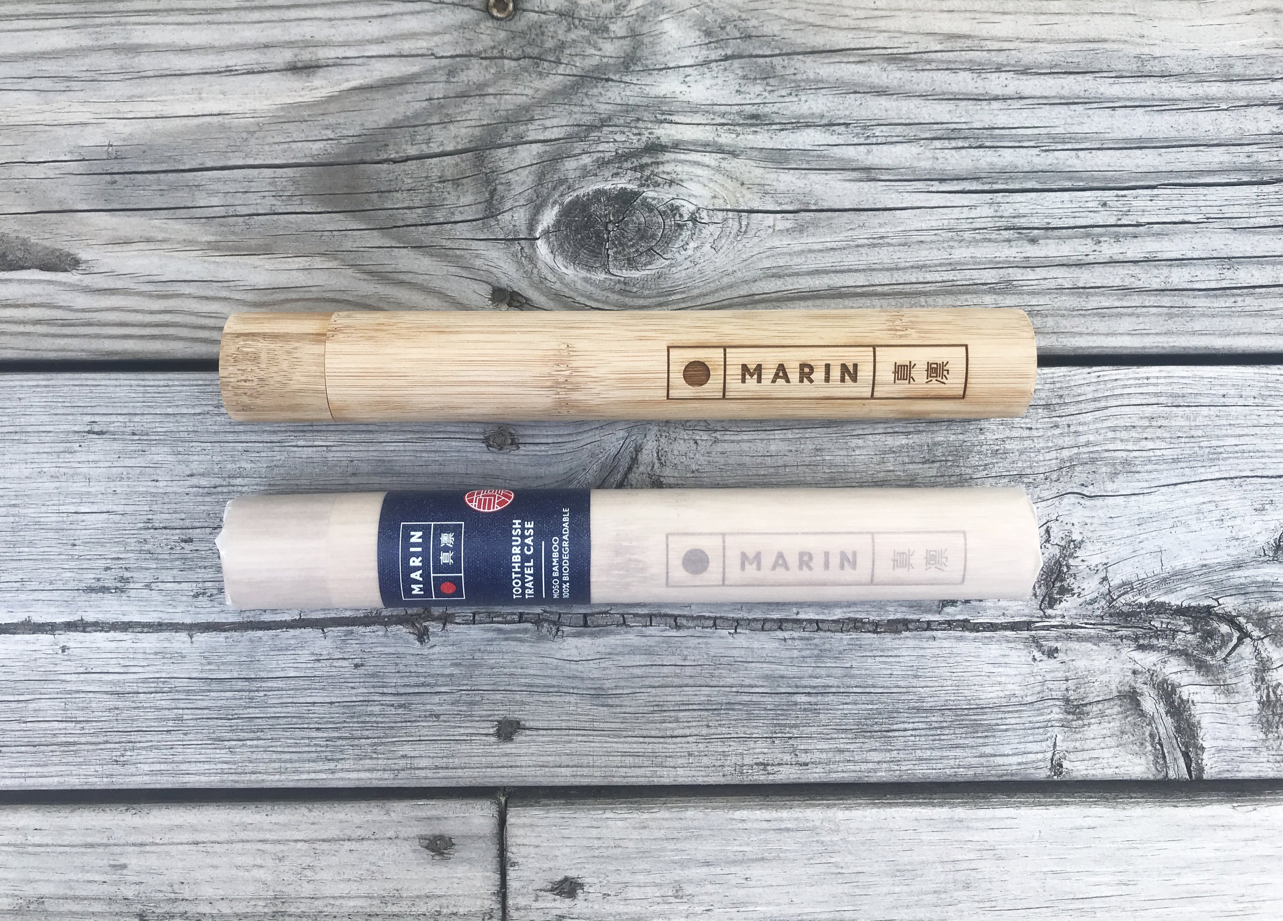
Packaging Solution
MARIN 真凛 offers a fully plastic-free packaging system made from paper. The soft translucency of the material reads as clean and hygienic, making it a natural fit for bathroom products. The products themselves use materials like bamboo and glass, keeping the overall approach minimal and sustainable.
Every decision, from structure and material to cultural reference, connects back to the brand's core idea: encouraging more conscious consumption through thoughtful design.
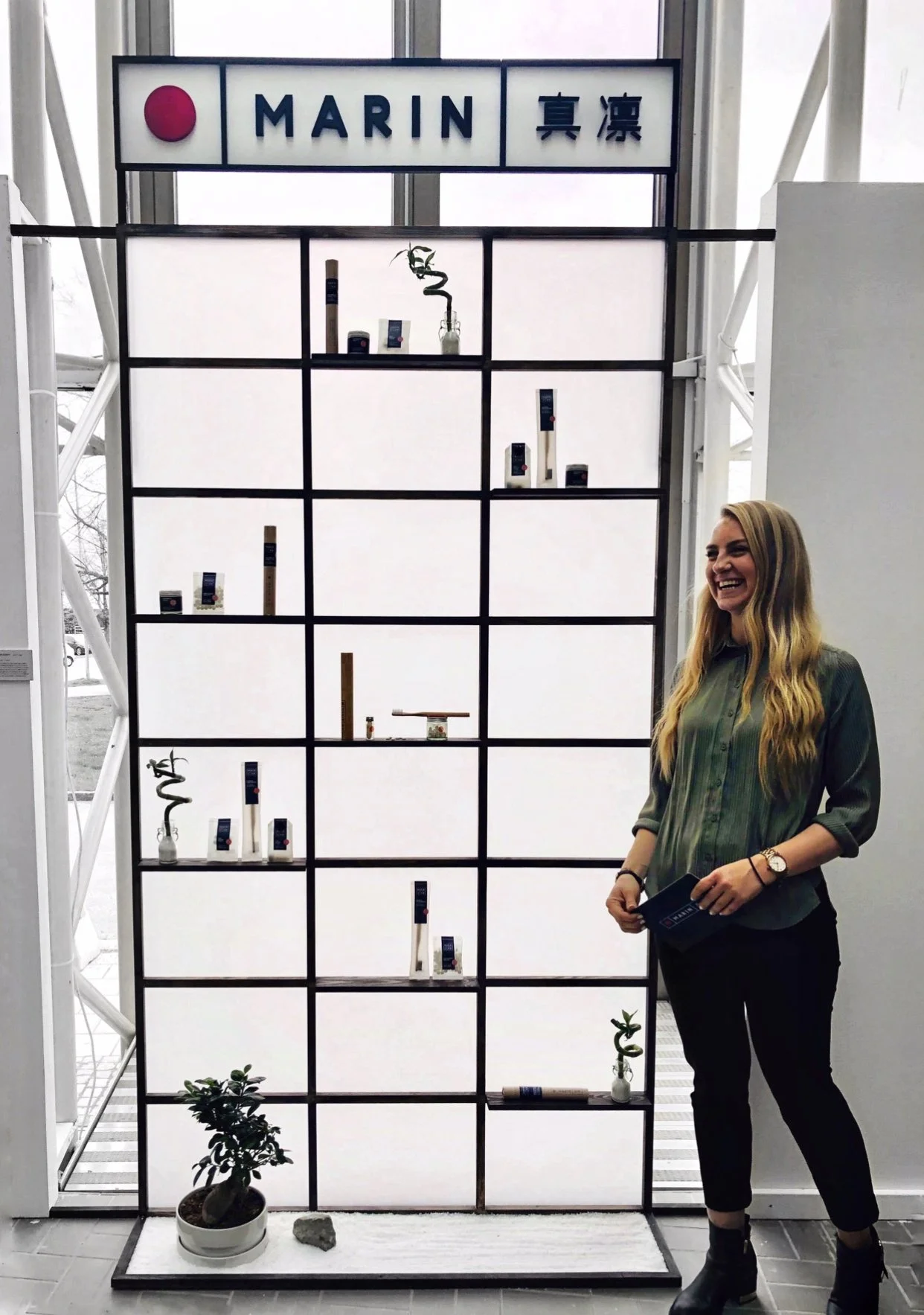
Exhibition
For the graduation exhibition at Kulturhuset in Sundsvall, I designed a shōji-inspired installation to extend the brand into a spatial experience. Natural light, translucent materials, and a small zen garden were used to express calm, balance, and a strong connection between design, nature, and sustainability.
The installation was individually voted class favourite by the year below, with the results compiled by the programme director