Brand Strategy / Visual Identity / Art DirectionUnited Insights – Brand Identity
A fresh identity for a bold, women-led social media agency. Modern, mature, and built around the idea that great work happens when you and I work together.
The Project
United Insights had an existing identity with some charm to it, a circular logo that visually united the two words, warm coral tones, and a personality that felt approachable. But it had aged and no longer reflected where the agency was heading.
This was my final self-initiated project before leaving the company. A way to leave something behind that the team could be proud of. The goal was to build something new without losing the warmth of what was already there.
The Idea & Result
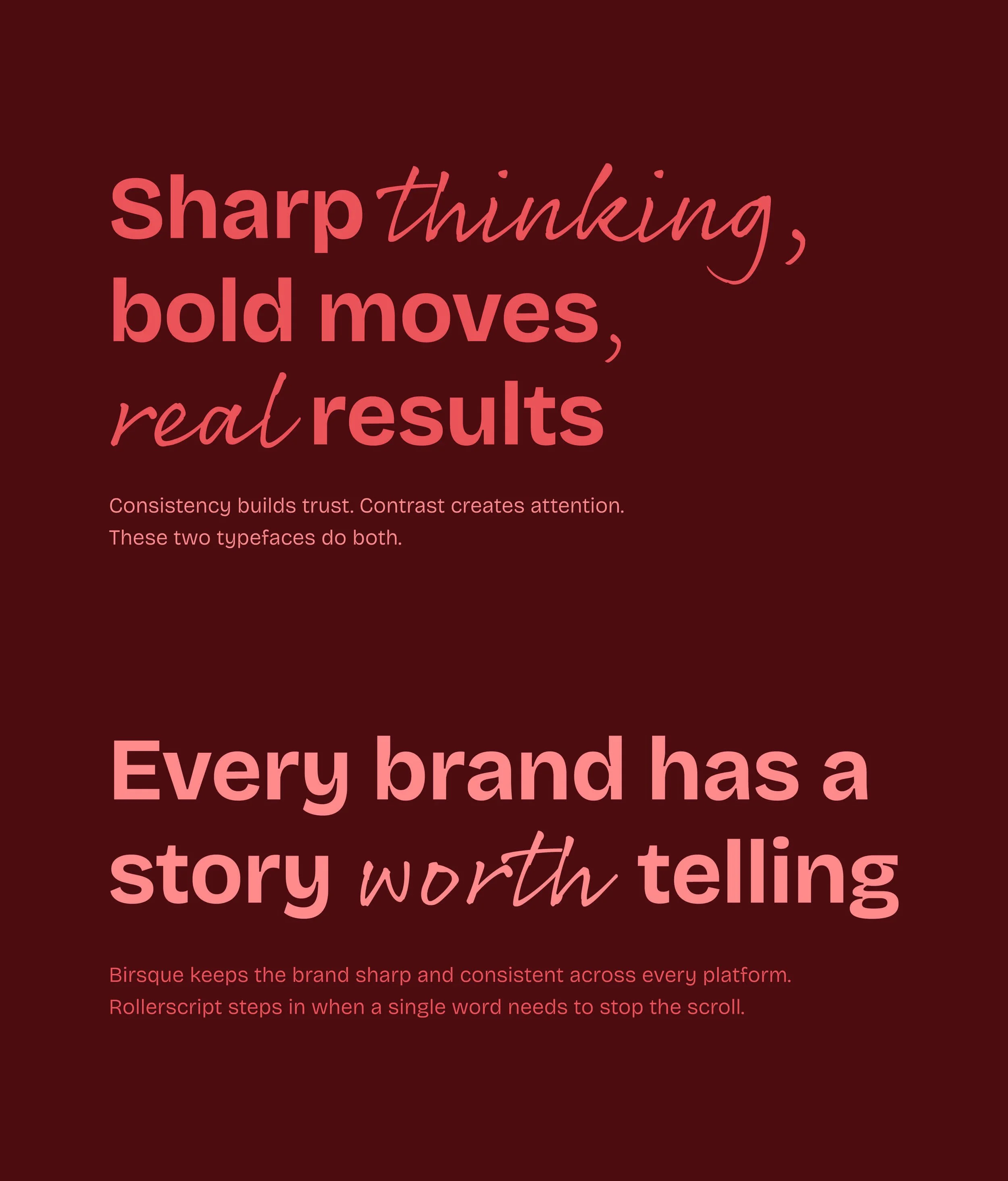
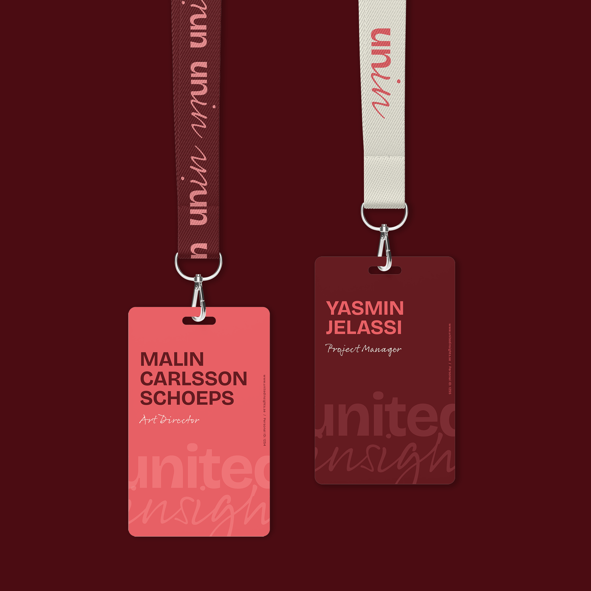
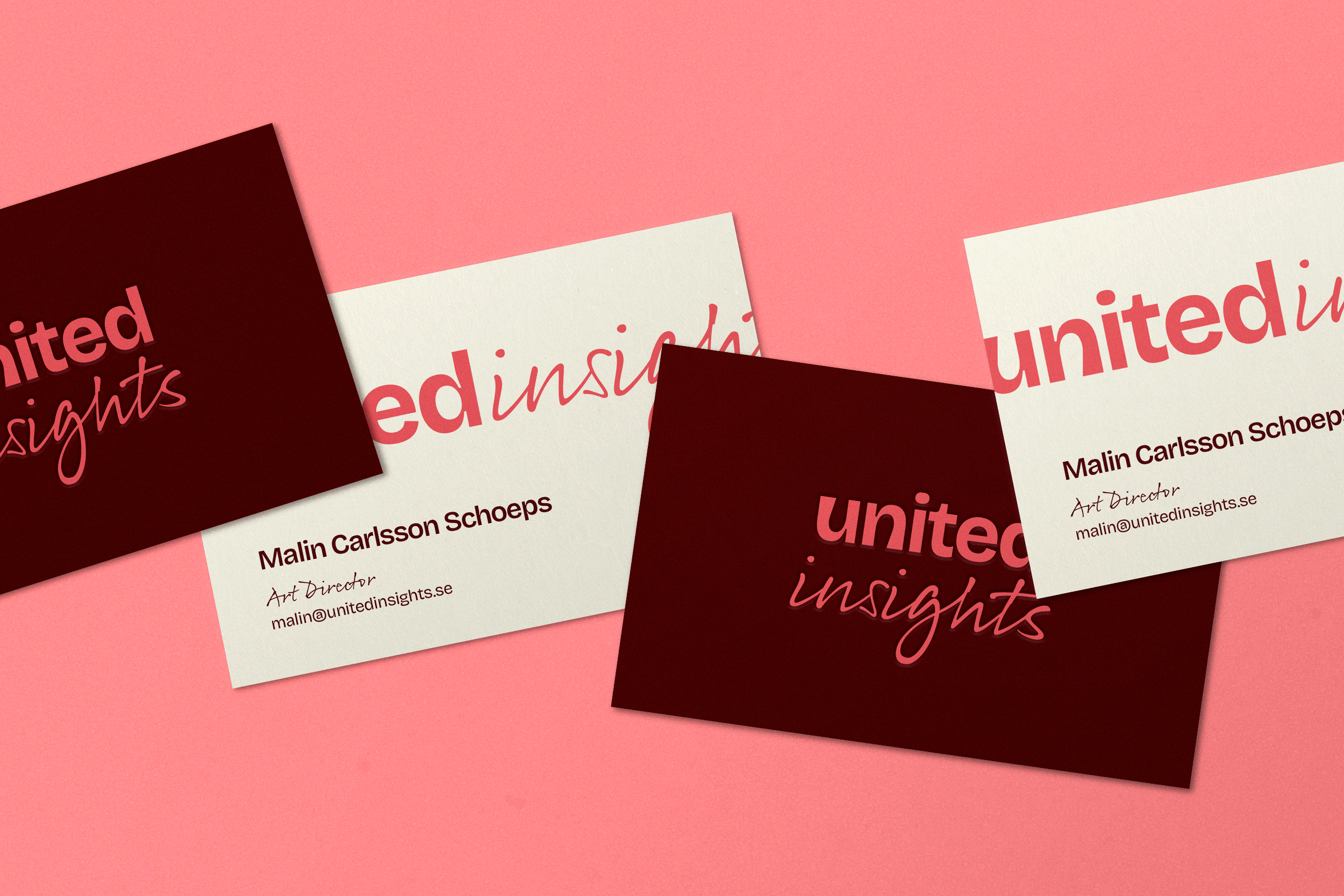
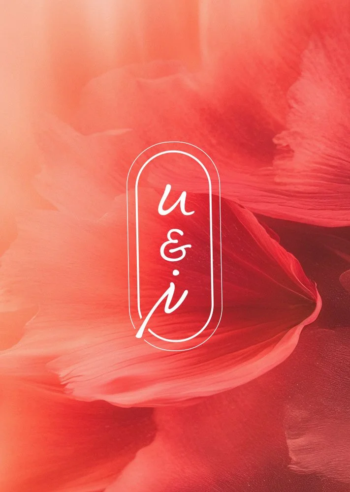
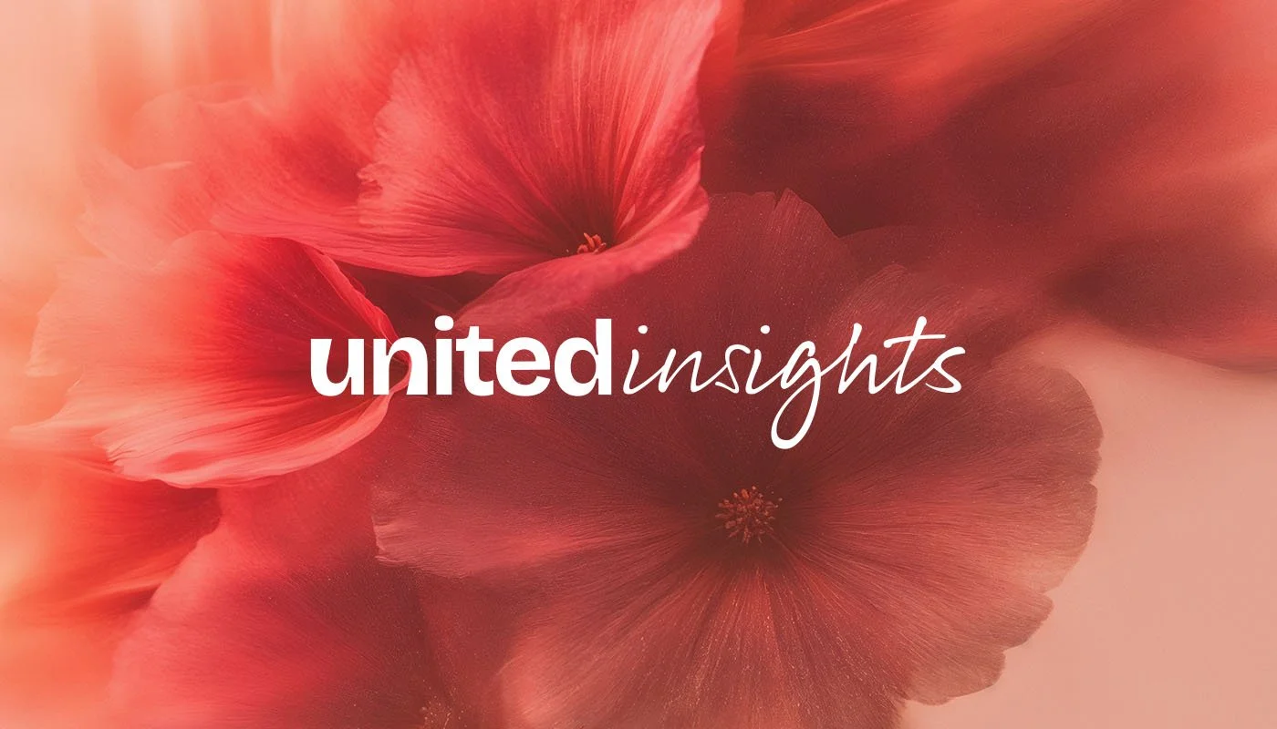
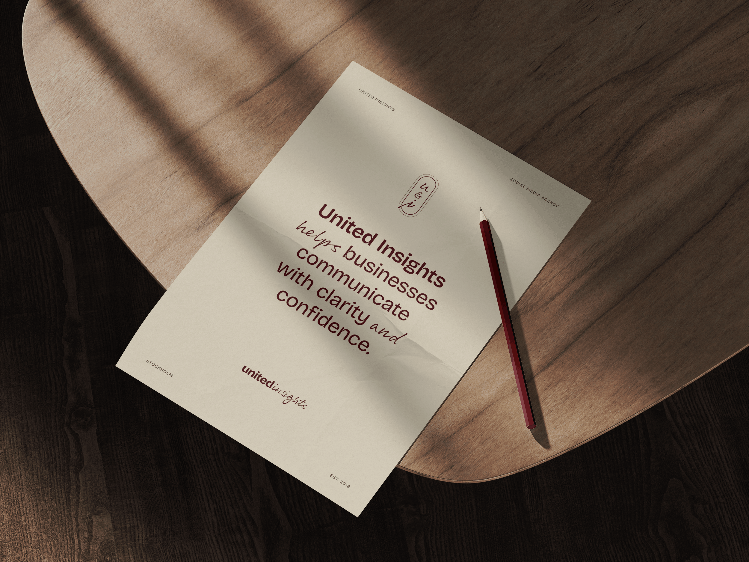
The concept is built around U&I, you and I. U for the client, I for the agency. A simple idea that says something true about how United Insights works: in close collaboration with the people they serve.
That idea became the foundation for everything. The logo, the typography, the colour palette, all of it points back to the same belief that the best work happens when two parties show up fully for each other.
The finished identity gives United Insights a visual language that is mature, warm and built to last, one they can grow into rather than out of.
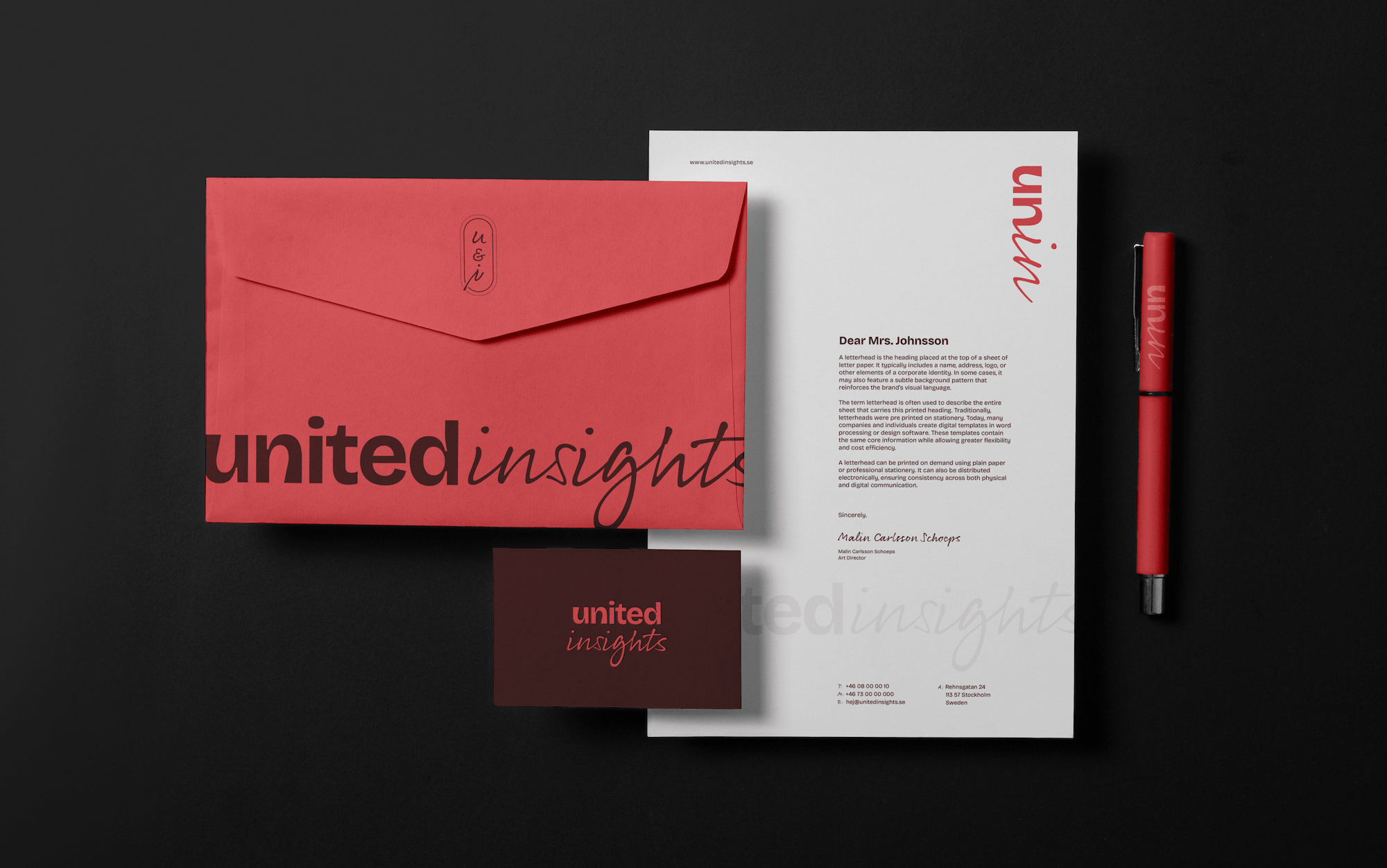
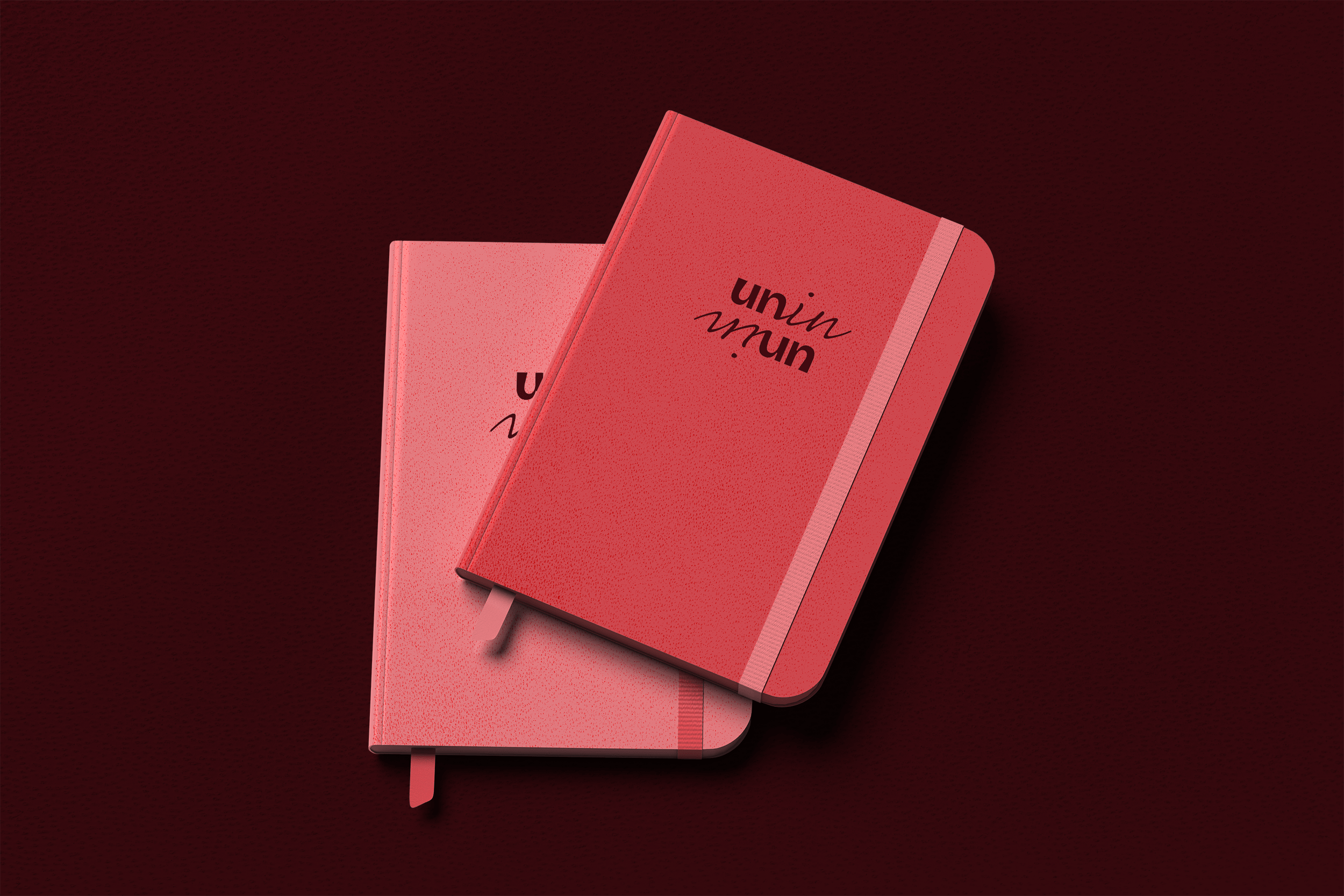
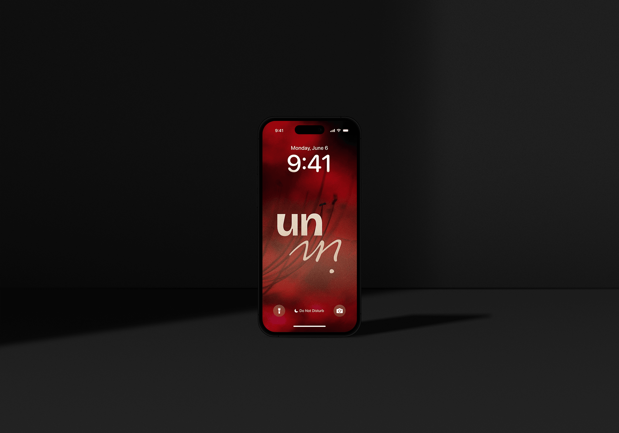
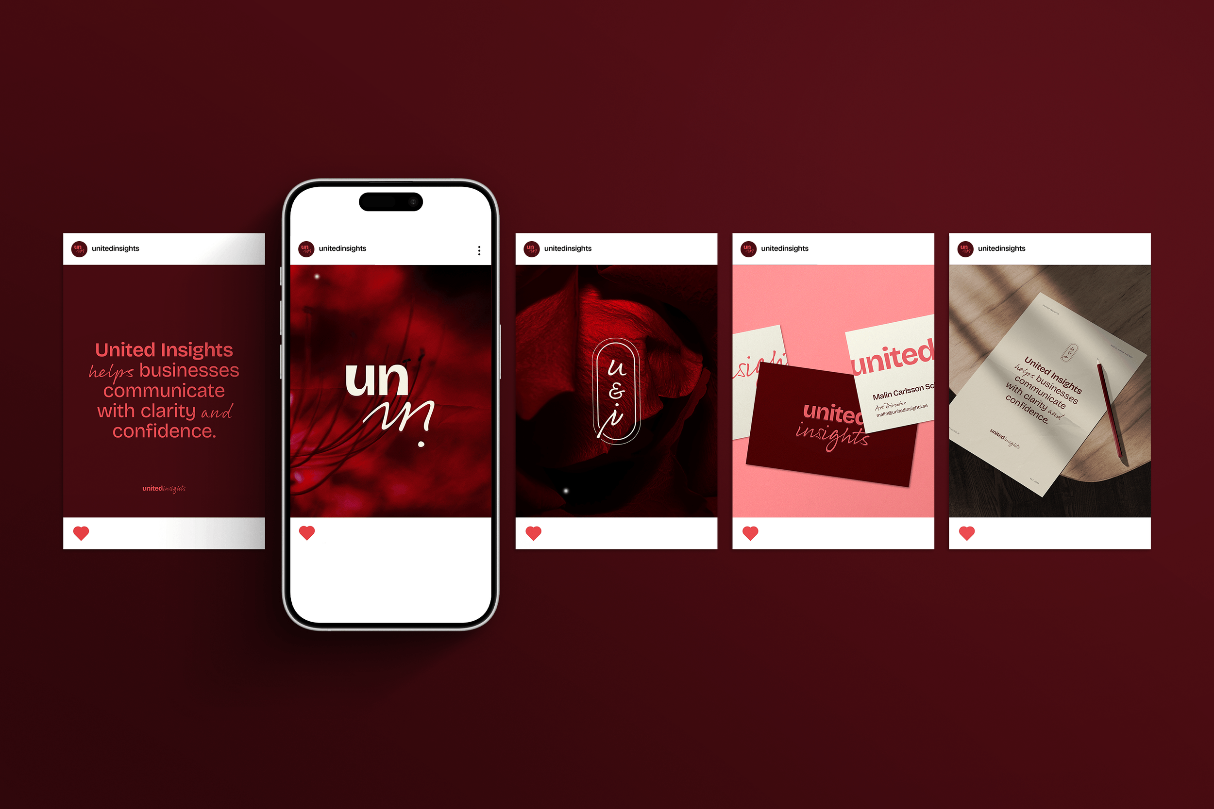
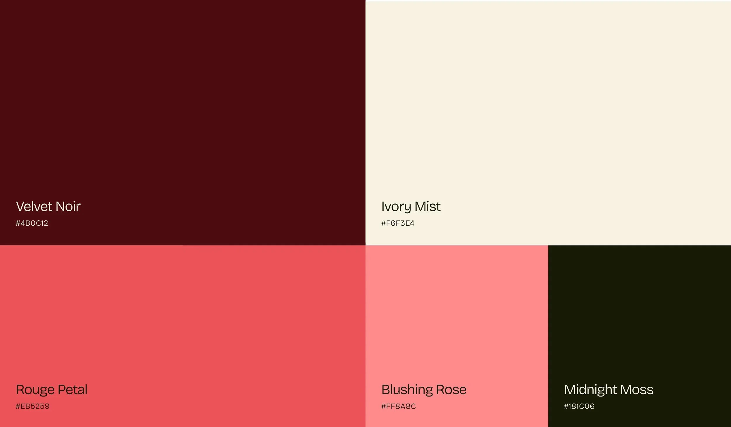
Colour Palette
The palette takes the original coral as its starting point and builds outward into a modern, feminine direction. The hero colour is a deep, mature red that feels bold without being aggressive. It is a colour that means business while still feeling warm and considered.
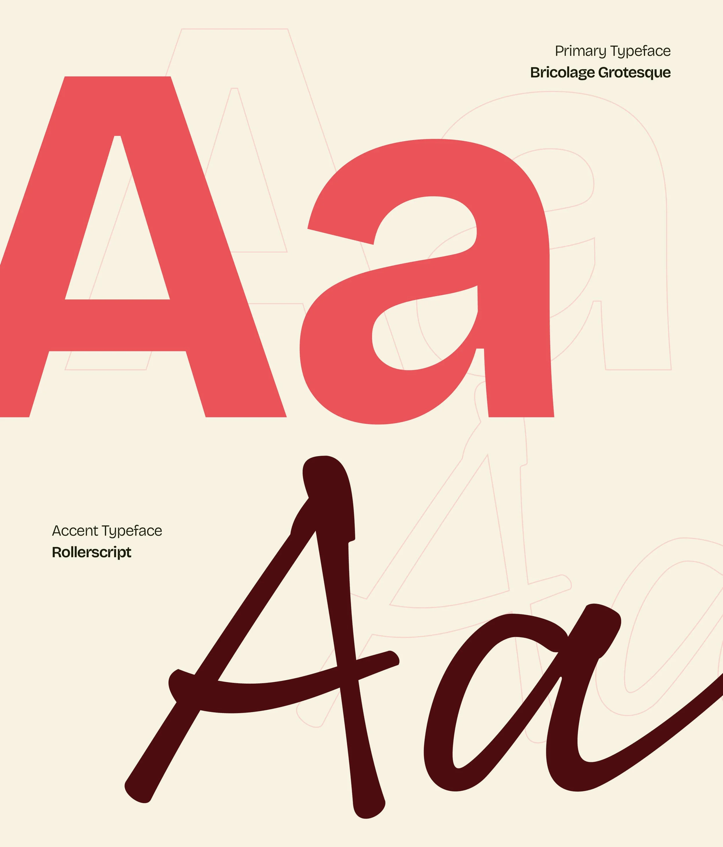
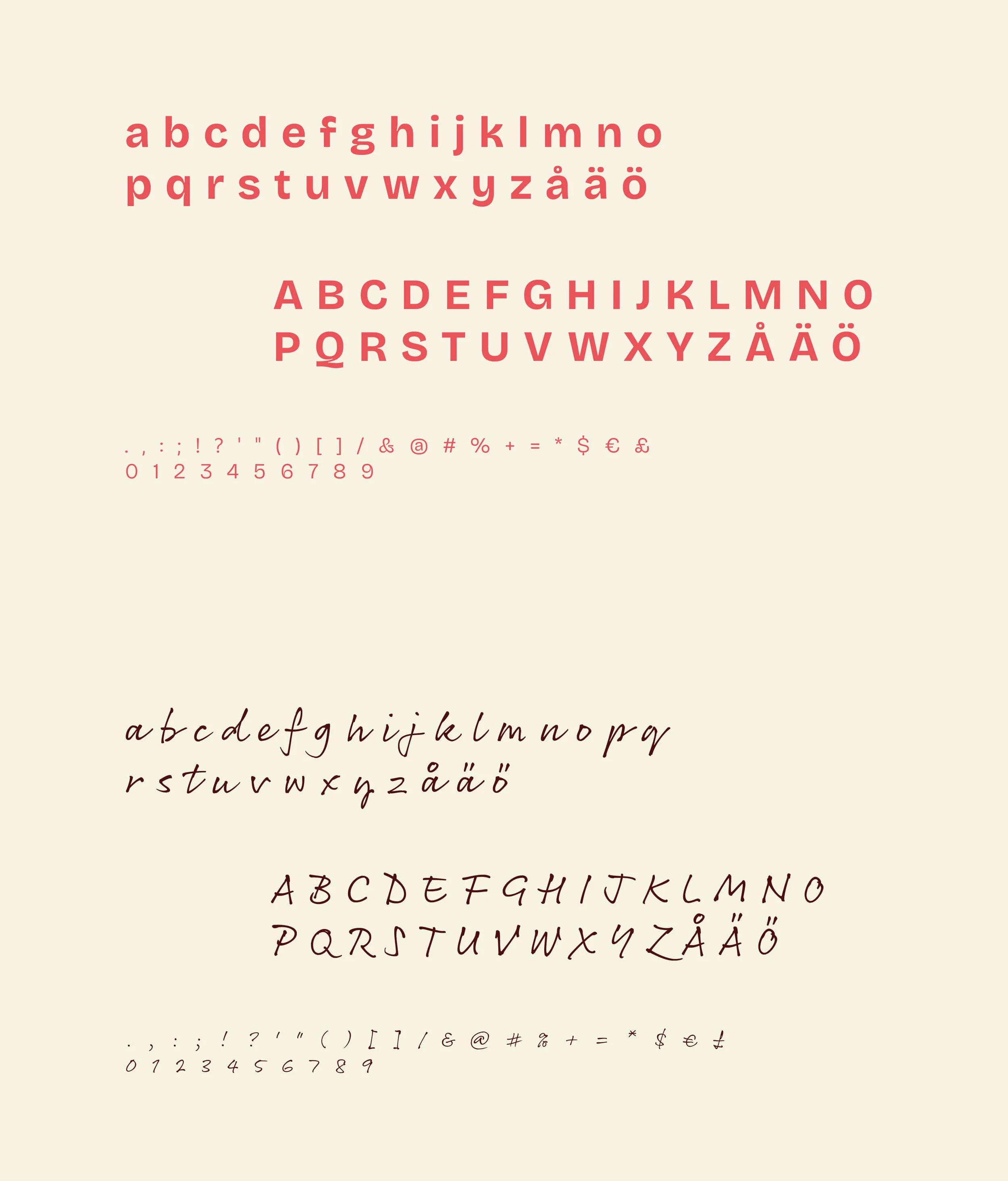
Typography
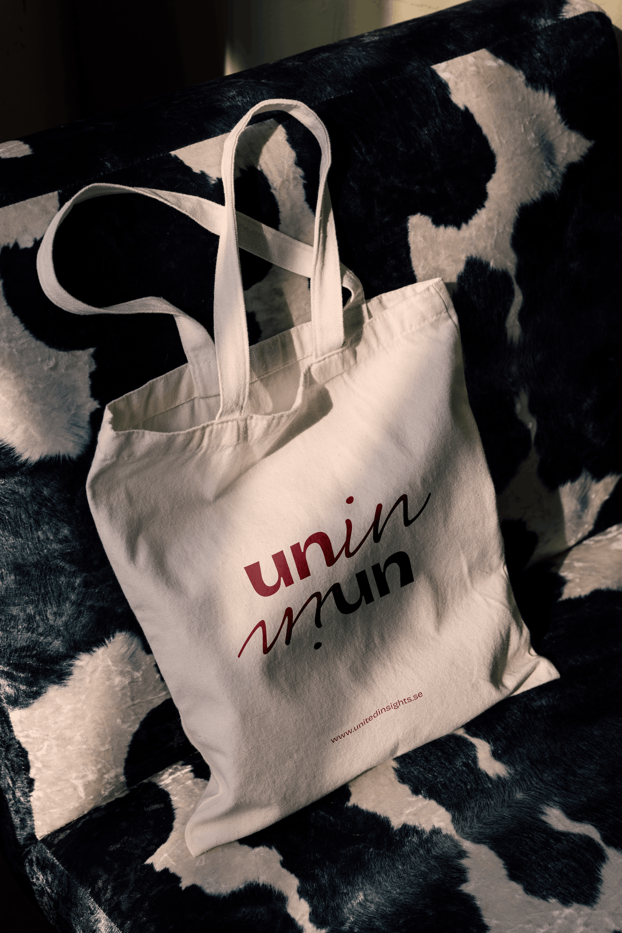
Bricolage Grotesque is the backbone of the identity. Strong, flexible, and quietly feminine without ever feeling delicate. Its range of weights makes it equally at home in a bold campaign headline and a refined client presentation. Rollerscript enters selectively as an accent typeface, adding warmth and personality where a single word needs to do more.